Holistic Platform Redesign & Design Team evolution - Case Study
The problem
How to improve…
A legacy Product of over 20 years
Built at different times by different teams
Multiple sign-ons
Inconstant UX/UI
Out-of-date user workflows
Support swamped with user pain-points
Our Start
Together with our Head of Product, I defined a preliminary set of goals.
Discoverability - Features and functionality must be intuitive, easy to find, require less training and support.
Usability - Workflows should be overhauled to be more efficient and direct.
Scalability - Designs should meet future needs and and growth.
We gathered a team, including our product head, top account managers, key sales personnel, and myself, to put together a proposal.
First steps with internal stakeholders
Concept Wireframes - Exploratory wireframes that could illustrate our ideas and create buy-in
Explore moving towards a product eco-system - Show how our product could become more modular and move seamlessly between applications
Add value - Highlight ways in which we could add value both short-term and long-term as we overhaul our products
Doing our homework
With the help colleagues in account management and support I identified key clients, and began reaching out to users.
User Interviews We conducted 30+ interviews in the initial stage of the project. As of late 2023 we had over 60 user interviews adding to our qualitative data.
Support Tickets I examined data from support. Excluding technical problems, I highlighted critical problems in functionality and work
Heuristic Evaluations I conducted evaluations of our products to identify common UX issues in our problem, and cross-referenced the user feedback we were gathering.
A few key pain-points we collected
Lack of single sign-on
Inconsistent terminology
Inconsistent iconography
Difficulty finding specific features
No central navigation
No global search
Applications using different databases
Needing to hop between apps to accomplish an action
Lack of client branding
Too complex
Long training times
Lack of proximity between related items
Key features and buttons hidden or not where expected
Not all information or analytics given are useful
Not enough support for collaboration opportunities
Unsure when system refreshes or new information is available
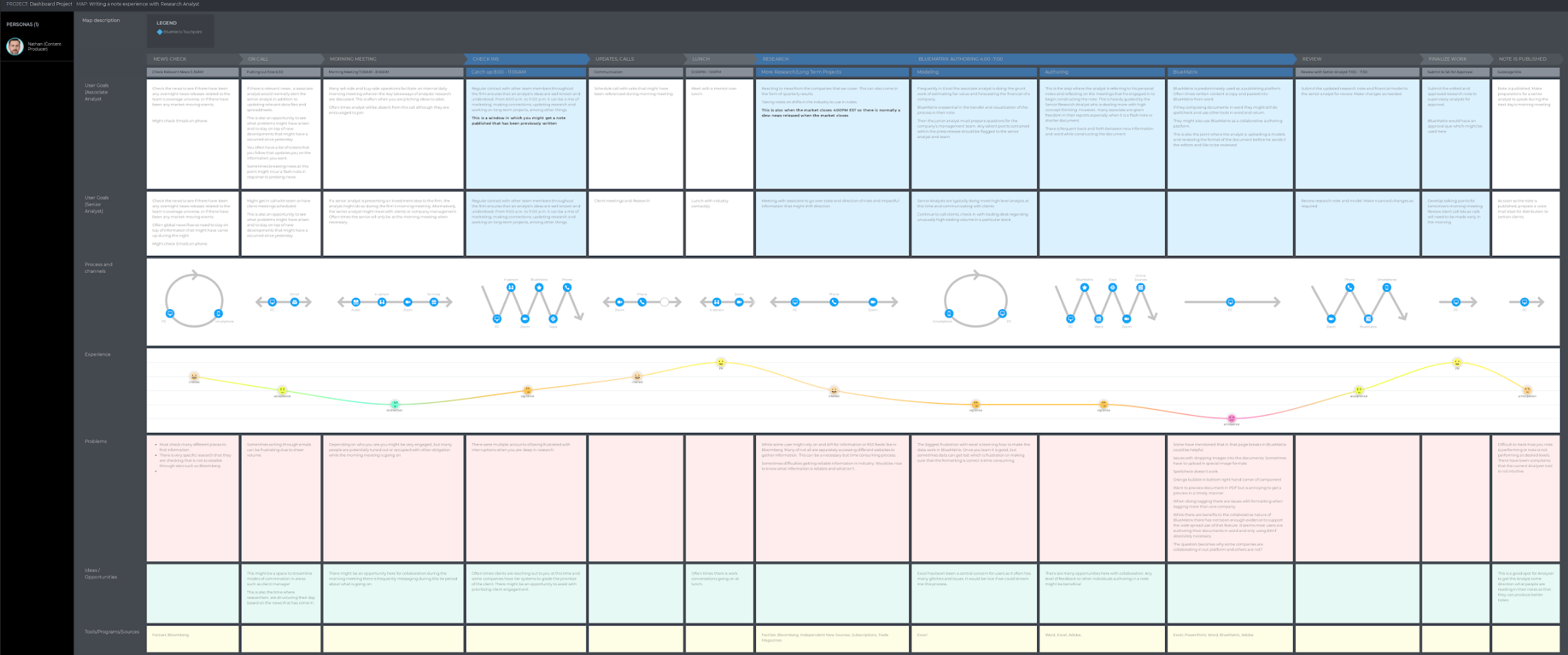
New User Journeys
Many of the user journeys through our product had not been mapped out before. Many clients were more than happy to share their workflow and their frustrating in order to improve the product.
Once our team had its bearing we began to build a user research program, essentially from the ground up. In addition to participating in client interviews myself, one of my goals was to bring on board a dedicated user researcher. While we had ways getting user feedback, I wanted to make sure that for the long term support of the project we had a process whereby we could talk directly with users, create designs, and then get feedback on those designs throughout the life of the project and beyond.
Partnering with our account managers and colleagues in sales, we reached out to dozens of our clients who used our product in different roles and capacities. Everything from admin, to average users and their supervisors. With our new user researcher built extensive user personas for each main role and delved into the pain points at various stages of their user journey.
Shout out to our talented UX Researcher, Robert Werder, who was a valued asset to our team at this time. Please visit him on LinkedIn!
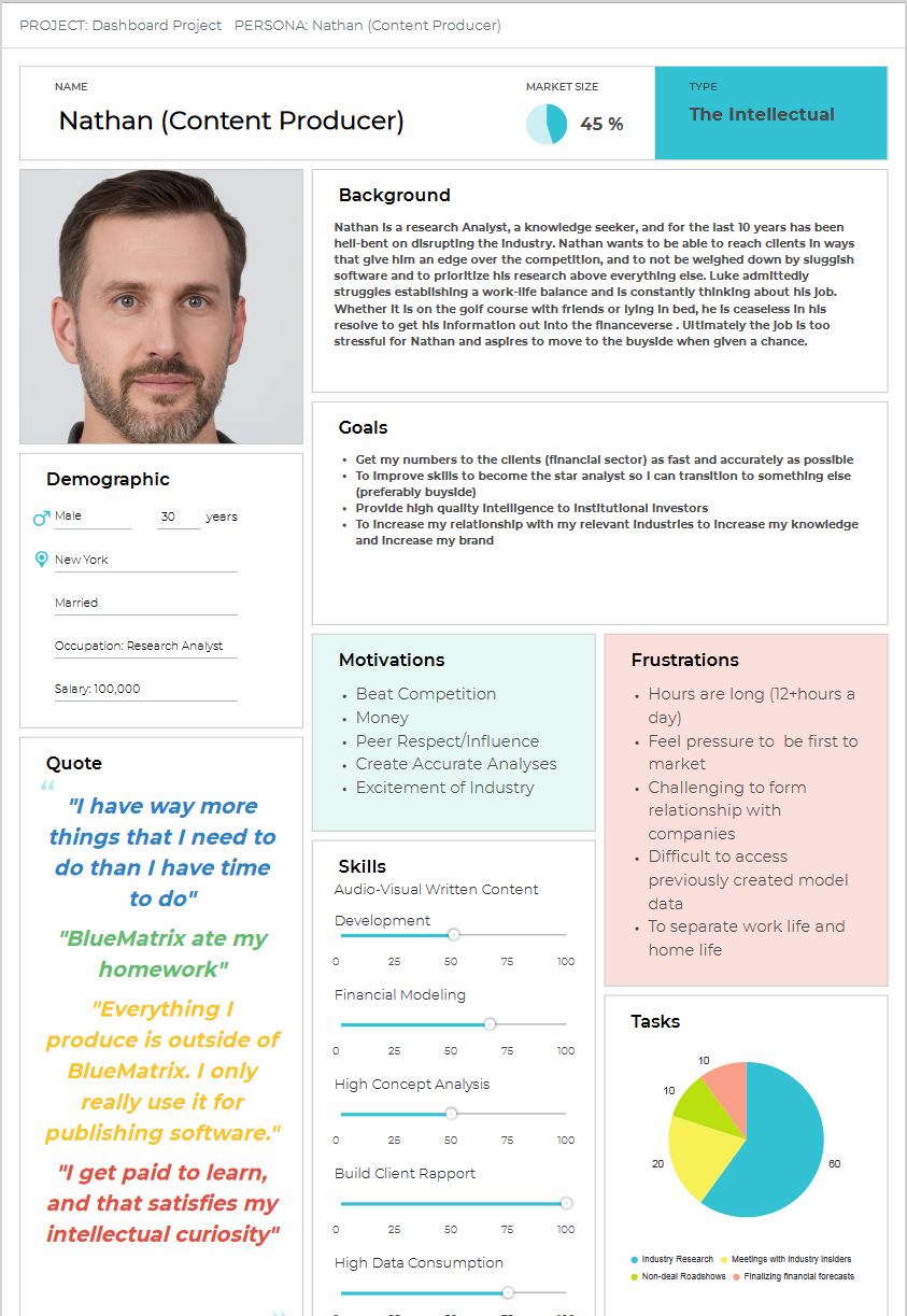
Personas were critical
Our product suite serves a variety of roles. It was important for us to take into account each of those roles, their challenges and commonalities.
Concept Wireframes
As new information came in from our users, we began to take all the feedback we had gathered, our goals, and business considerations, and sketch out a new product eco-system.
We started to bring together our ideas to design a new product eco-system
This was our time to really try to imagine something different. We envisioned contact pages, dashboards, widgets, and many new features. Many of these ideas have remained in the project and were further refined visually and functionally. These initial wireframes and low-fideltiy mockups were enough to illustrate the direction we wanted to go and generate support for our ideas. This was an intense period of rapid ideation, where I moved through dozens of iterations of wireframes as we began to refine our ideas and adjust them base on the user feedback we had received.

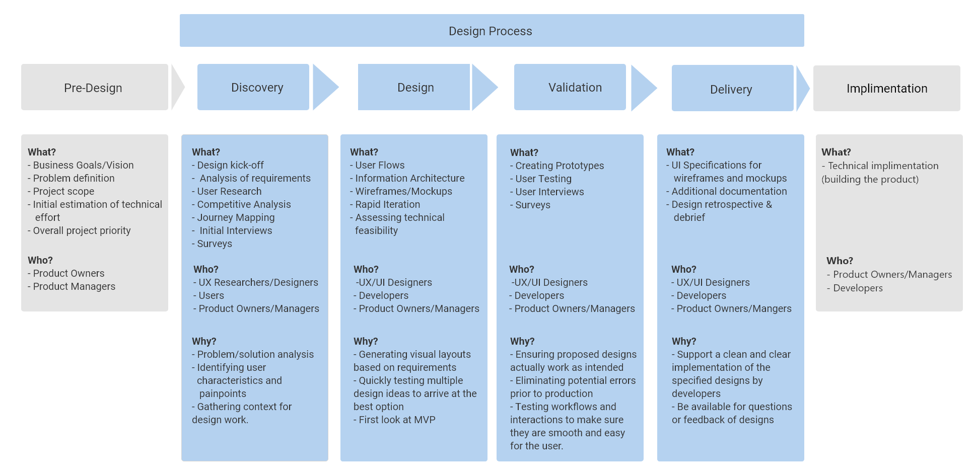
Design System
Improving the consistency across applications was always a core goal of ours. So throughout this process the evolution of a design system was necessary. We went through several iterations, beginning at essentially a version of Material design and slowly evolving towards something more appropriate for our products and brand.
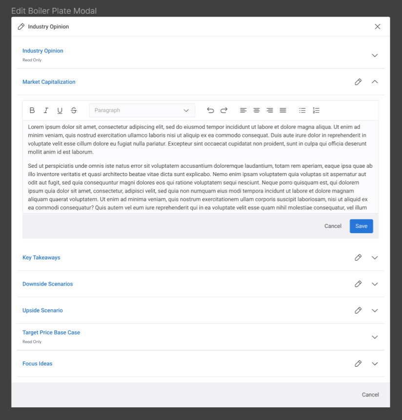
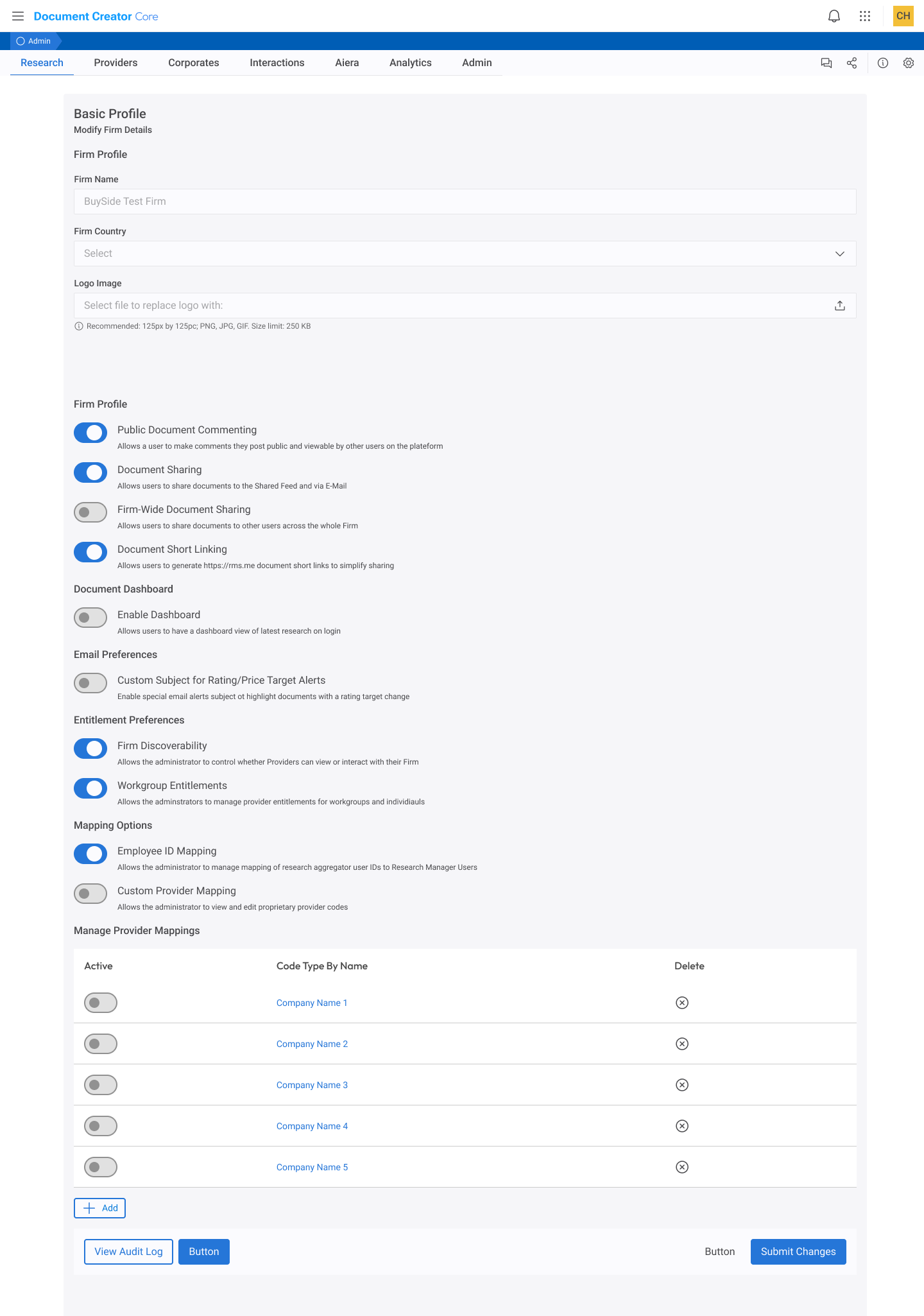
Redesigning our Applications & Establishing a Design Process
Without research conducted and on-going, pain-points documented, and all important parties on board we began the important and detailed process of redesigning many of these applications from the ground up. This was done in tandem with product experts to helped to detail out the existing functionality, along with new features so that everything could be accounted for in our design efforts. It was very important that no legacy functionality be left out that was still important or useful to our users. From a design strategy standpoint, I wanted not just the revised product to be good, but the experience of switching to it to be a positive one.
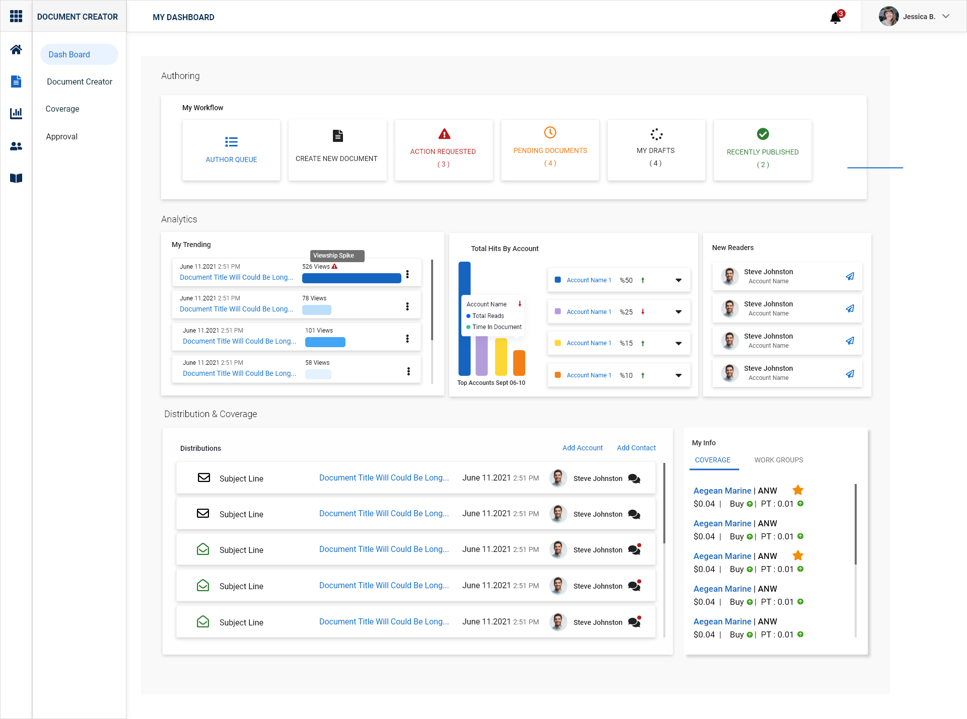
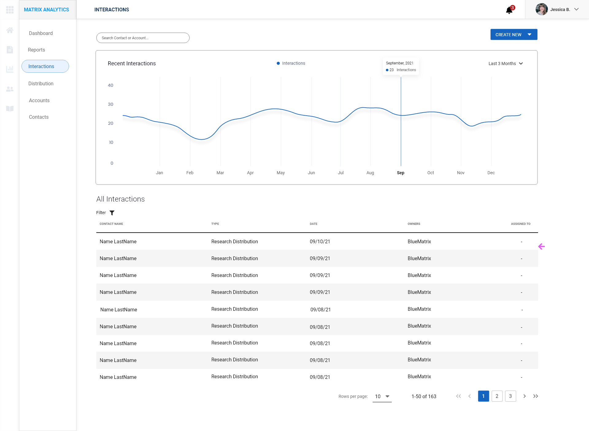
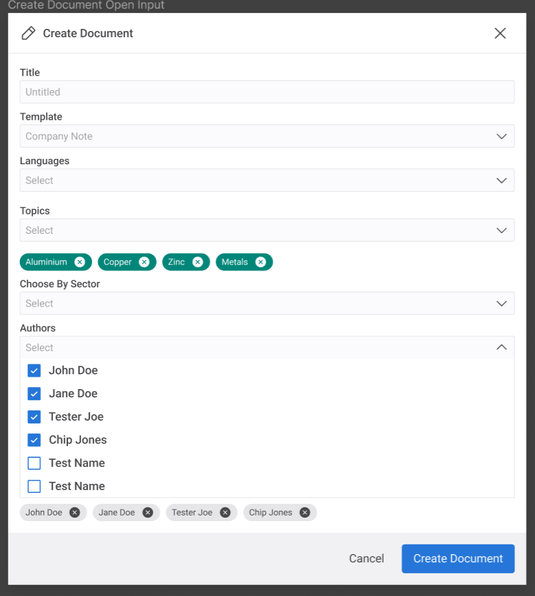
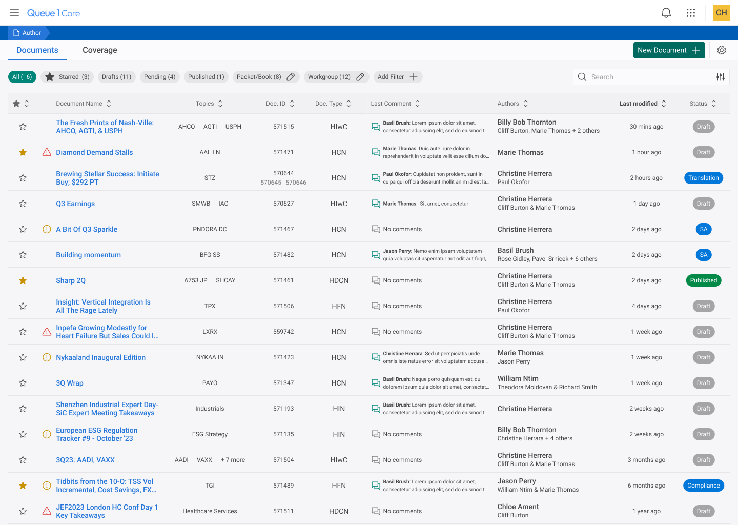
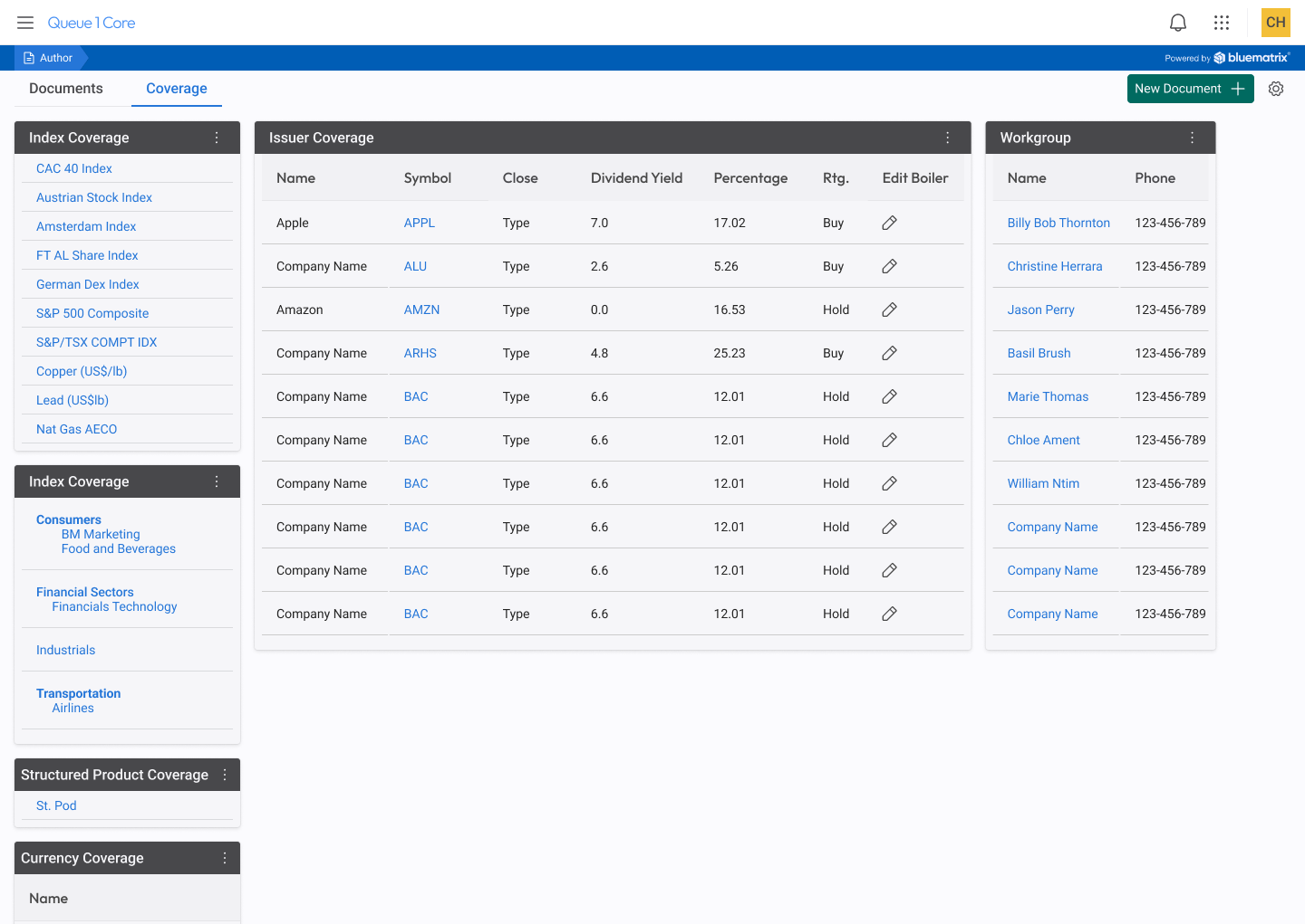
Due to needing to be selective without developer resources, our team chose certain applications to redesign first, based on user needs at the time. The first area of our product that we fully wanted to redesign was called the Approval Queue, which I have documented as it’s own case study here. It was followed shortly after with the Author Queue, pictured below.
Shipping the Product then continuing to improve
After roll out I continued to stay active and collaborate with product and development to improve the queue even further.
Frequent reviews/check-ins with product to assess user training, roll out experience, as well as feedback regarding the product itself.
Working on “phase 2” features, such as bulk actions, and further refinements to filtering and workflow.
Improving configurability as new feedback is gathered on how users want to set up their queues within the new design.
Conclusion and Impact
While in someways a project like this is just the beginning of a platform redesign there were some huge accomplishments that will have a positive long-term impact.
Creation of a Design System
Integration of Design process/methodology into product pipeline
Establishing a cohesive creative vision for a true product eco-system
The successful redesign of one application with several others soon to follow.