What is the Approval Queue?
The Approval Queue is a critical part of a suite of products focusing on financial research publication. Every research document that is made with our editor has to be approved via this queue, making it an integral to the daily operation the clients it services.
The Problem
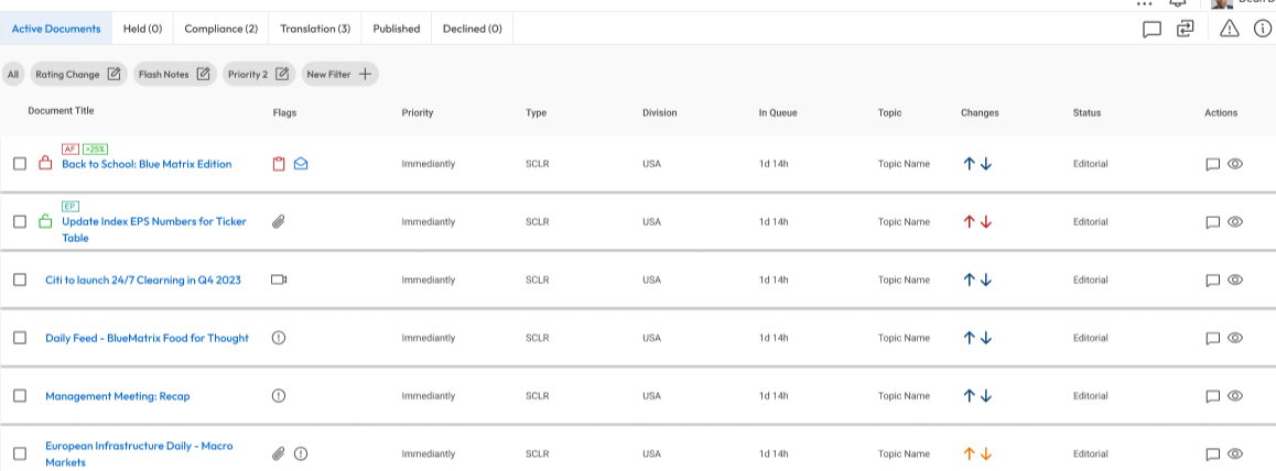
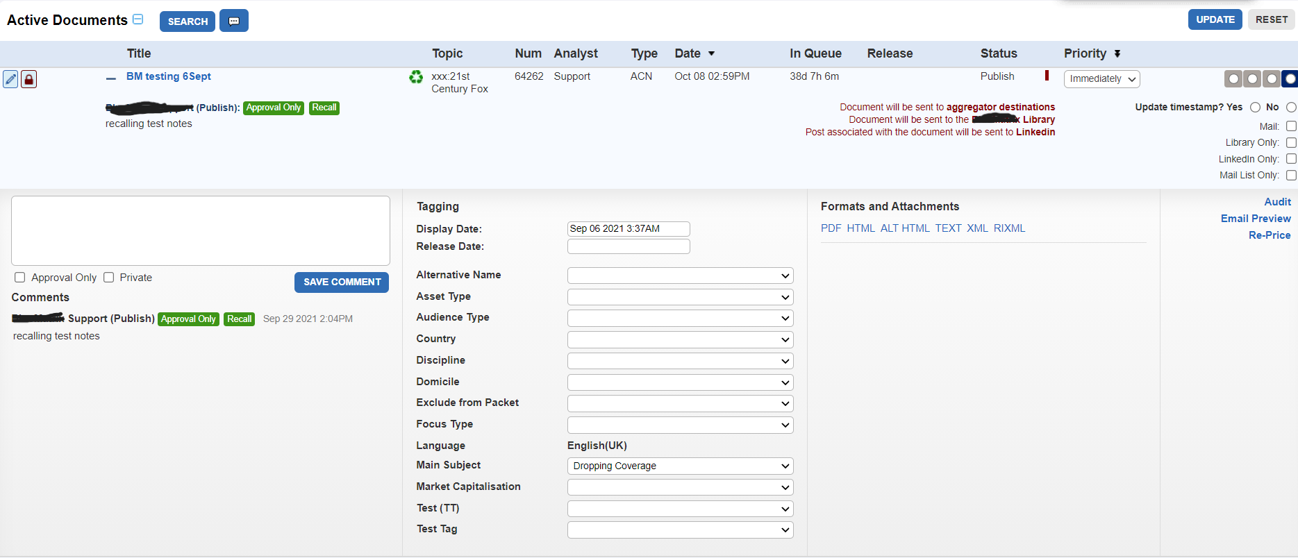
The existing Approval Queue was out of date, and had a host of user pain-points that were brought up frequently to Account Managers and Support. Additionally, there were several incoming new clients that had certain requirements that the old queue could not accommodate. Moreover, due to the large degree of process variation between clients which makes a “one size fits all” approach impossible.
We needed a new approval queue design with a lot more flexibility for our clients.
My Role
Lead Designer, UX Researcher
Discovery & Research Phase
The original product was developed without the use of any UX methodologies. As such, there were no existing user journeys, personas, or organized client feedback to draw on. This made a Discovery phase even more critical to understand not only current client needs and pain points, but the why behind existing features and functionalities.
I worked internally to gather information from our Account Managers and Support Staff on clients that we could reach out to, especially clients that had a lot of people using the application in question. We conducted over 30 semi-structured interviews with the main roles that were involved with using the application. I also conducted multiple discovery calls with key stakeholders with our new clients who required new or additional features not currently available in our old queue.
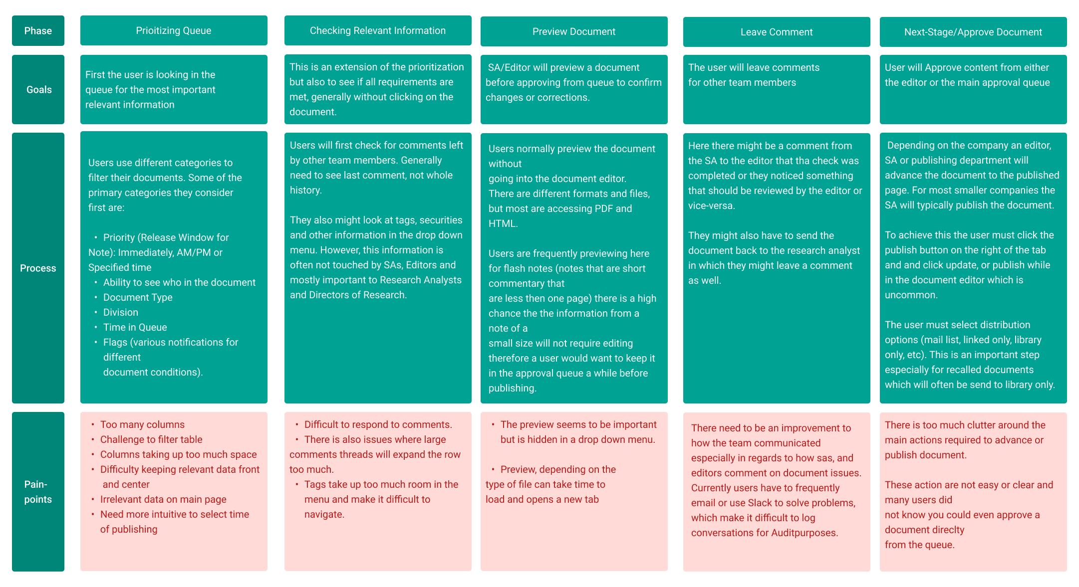
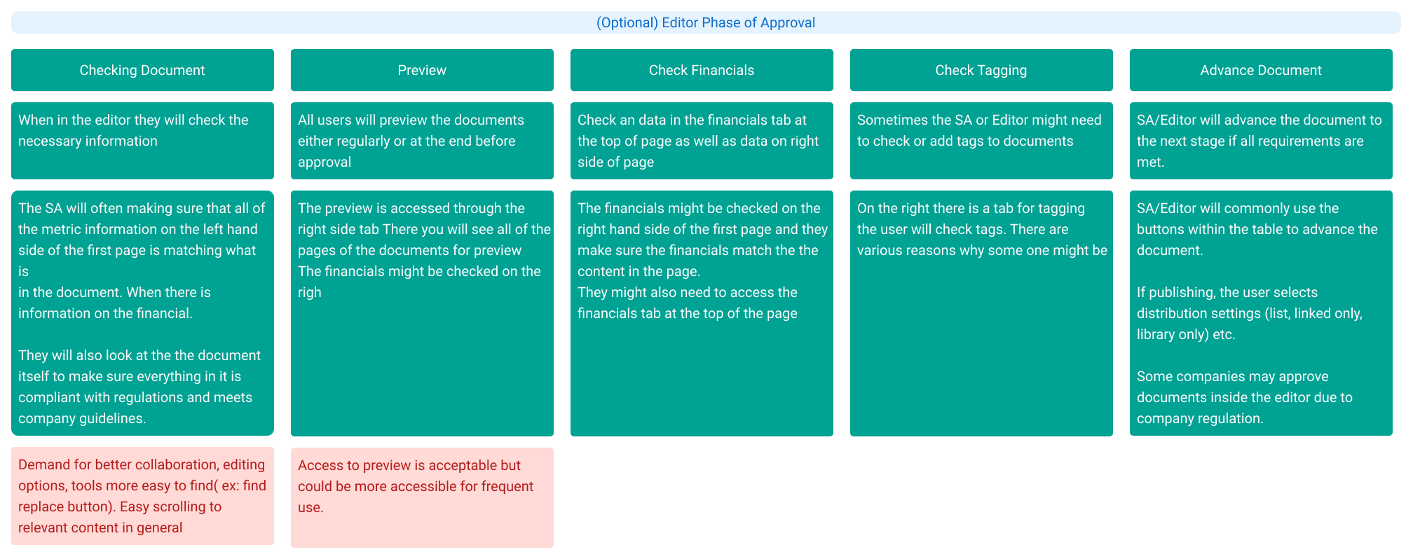
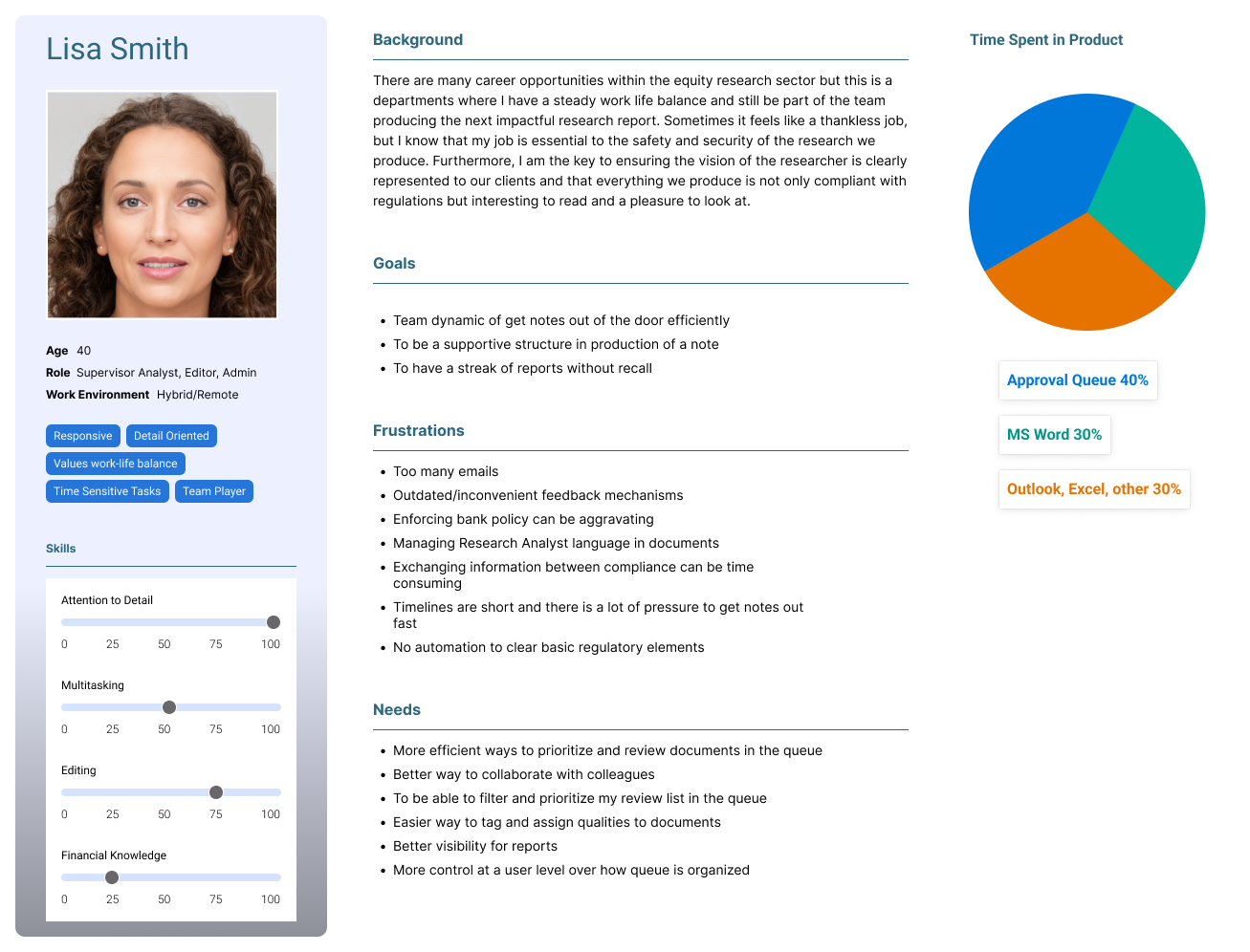
Through this process I was able to build out User Journeys and Personas.
Key Take-Aways
There were some clear themes and takeaways from the Discovery phase.
Document Filtering
Document Prioritization
Finding relevant information
Ease of access to key features such as “preview document”
Lack of ability to communicate effectively with team members about a document
In our interviews, users were able to either tell us, or very often show us via screen share, that they kept running into problems organizing their queue. It was both a problem of lack of good organization features, but also problems with the overall layout of the interface. This became apparent when users frequently shared sentiments such as:
“When I expand a row in the queue I can’t see any of the other documents”
“If there are too many comments it takes up the entire screen”
“I wish these columns weren’t here, I don’t need them.”
“I didn’t know you could access the document preview from the queue. I thought you had to open the editor.”
One very telling interview revealed that this particular user did not know that a document could be advanced in the queue. This resulted in them having to open the editor each time they wanted to advance the document in the workflow!
Another big problem that became apparent was the problems using the existing comment feature in the application. This generated high volumes of additional emails and slack messages that contain essential info but were easy to lose.
Design Phase
Early on I decided to find a better layout that would allow the reorganization of key features. From a business perspective, we needed to improve the product’s scalability. From a usability perspective, I wanted to start to create a sense of clarity and focus around features and workflows that would be easy to learn, train, and fix some of the violations of the proximity principle existing in the old interface.
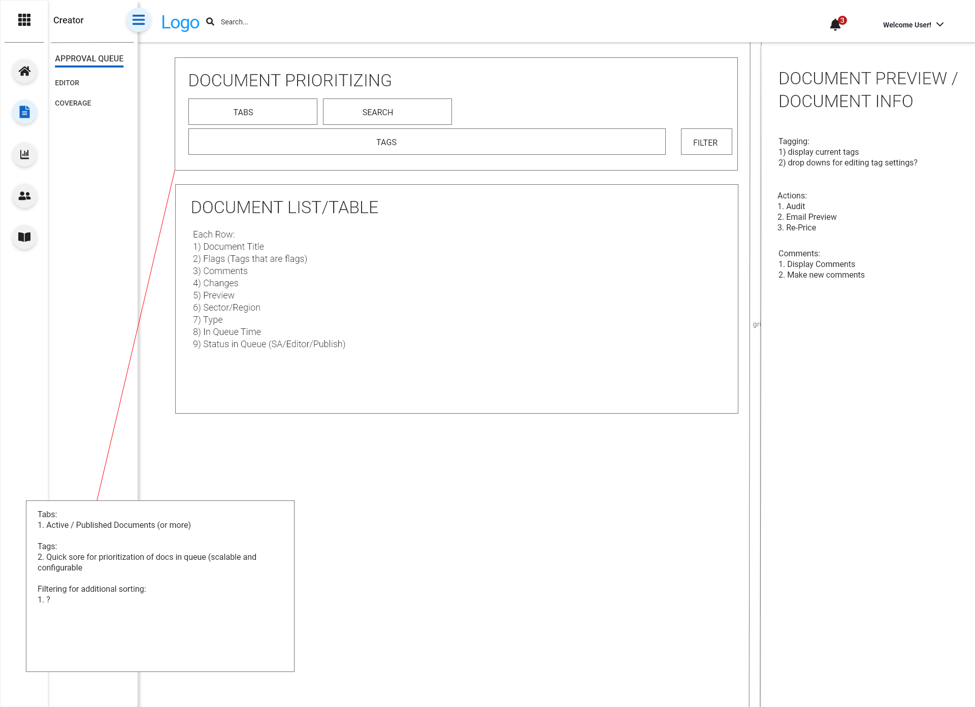
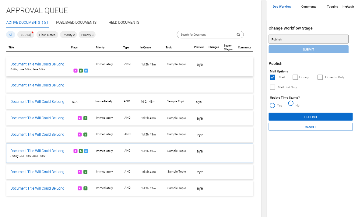
I put forward some concept wires focusing different zones in the layout around key problems users were trying to solve. Namely, (A) document prioritization, (B) document table containing columns with key info, and (C) a side drawer for tasks/workflows.
I put forward some concept wires focusing different zones in the layout around key problems users were trying to solve.
Namely, (A) document prioritization, (B) document table containing columns with key info, and (C) a side drawer for tasks/workflows.
The design phase continued with a series of rapid iterations and active discussions around the best way to implement different features.
We moved rapidly and started figuring out how
Whatever it is, the way you tell your story online can make all the difference.
After a period of rapid iteration, we began to finalize the UI and arrive at more would be the final product.
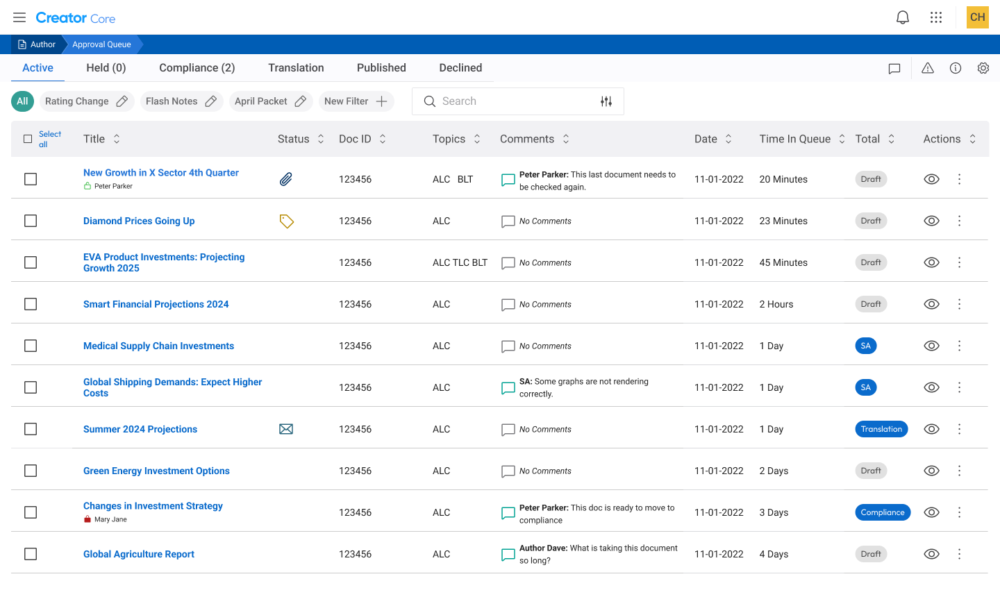
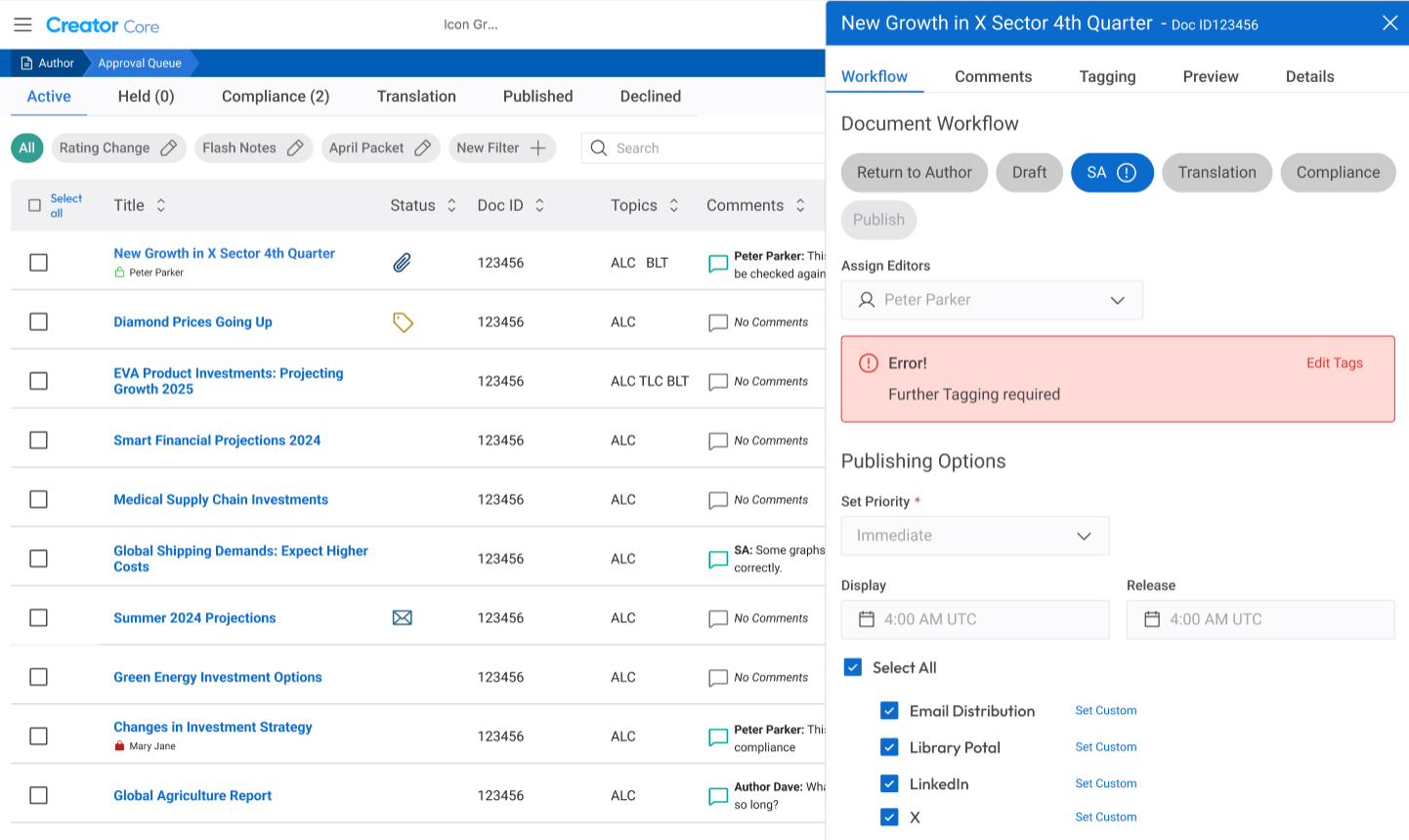
At a glance we solved a lot of items that were important to our users.
Ability to multi-select documetns
visibility to other editors in a document
Improved comment visibility (we displayed the most recent comment in the table, and clicking on the column opened the full discussion in the side bar)
Document Search
Filtering
Tabs for different document stages
Reduced clutter on screen
Refined and simplified workflows for most important actions
I really wanted to tackle the problem of prioritization and organization that our user’s brought up in the interviews. In our old queue, all the documents were in the same table. I implemented a series of tabs to divide the queue into manageable sections. These could easily be adjusted by an admin to conform to whatever process a client might have.
Additionally, customizable chips were added in order to filter for specific document types. Documents might have multiple qualities, including special releases, various types of packets, specific authors, or pertaining to a type of sector. User’s would be able to set up their own filtering criteria. This would allow user’s who may have responsibilities for particularity publications quickly sort for that specific type. Some users could not even find the search in the previous queue!
Adding new features…
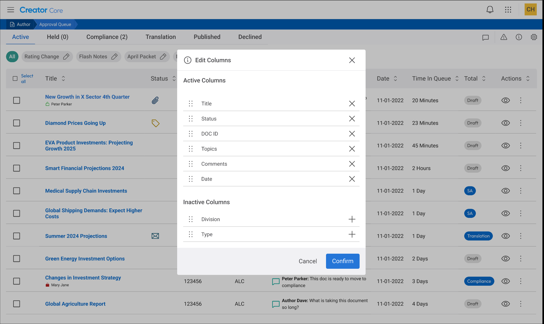
We were able to add several really cool new features that further helped users to adjust the queue to their needs. For example, we added the ability for users to select/de-select columns and reorder them in the queue. This meant that users could always prioritize the information most relevant to them and cut down on clutter. This feature was very well received by our users.
Simplified Workflows
We were able to simplify workflows so that users could simply click on a row and change the stage of the document, view errors, or change distribution options very easily.
Conclusion and Impact:
The finished designs were given to our developers and completed in time for the on-boarding of several new clients that required the updated queue. Soon after, we started transitioning the rest of our clients onto the new queue.
As with any implementation of a new or revised product, there will be bugs or somethings that need to be revised and changed no matter how many prototypes were created or tested with users. I view this stage as a critical part of the process, and I made sure to be available to our clients, especially those users who had helped us with feedback earlier in the process.
Overall, though, the project was a great success. Our users appreciated the increased configuration that allowed them to customize the queue to their needs. From a business standpoint, we created a much more suitable application that was a lot easier to add new features and onboard future clients which saved us costly development hours. We simplified workflows and were able to reduce support and training for the application which again reduced cost.
In conclusion, it did what good designs are supposed to do. Increase value for both the clients using the application and the business making it.

